
Table of Contents
Papyrus Author keeps track of various metrics in your document. This makes it easy to analyze everything from Styles and text statistics to the Style Analysis and Readability.
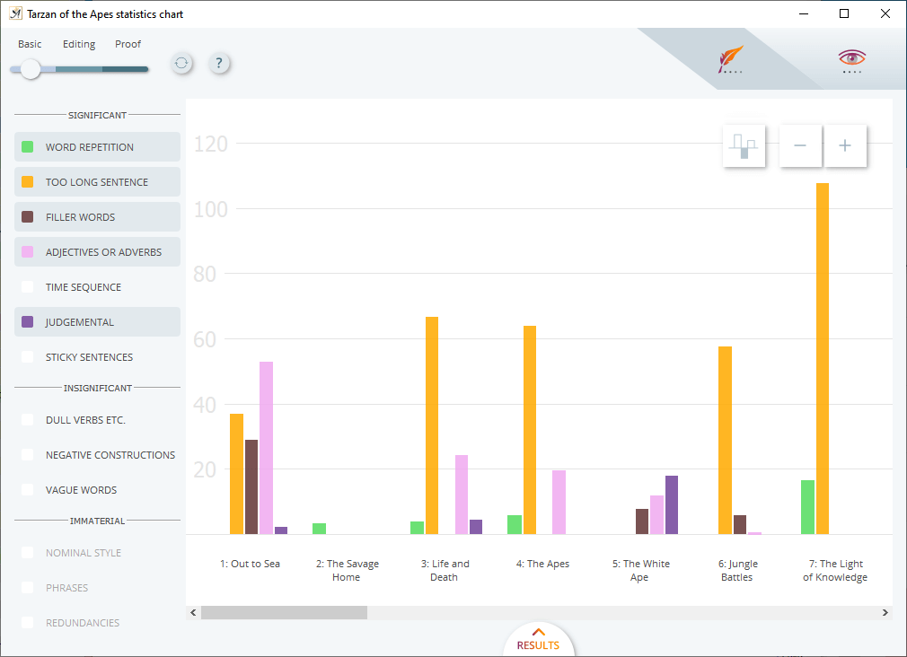
The Document Statistics Chart
Accessed by either the [ ] icon in the bottom toolbar or from the menu option “Document” → “Document Statistics Chart…” this dialogue provides a graphical display of either the Style Analysis or Readability statistics of your document.
The chart is not making a “good” or “bad” judgment on your writing, it is there to highlight which chapters differ the most in style and readability. Use it as a guide to help you focus on specific areas of your text.
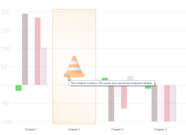
In order for the chart to display relevant information, there is a minimum number of chapters required (4) and a minimum of 1000 words. Results will only be displayed for chapters that contain 250 words or more. Any text which is direct speech will also be excluded from the analysis. So, for example, if you have a chapter which is mainly direct speech it may appear blank in the statistics chart if there is less than 250 words in the remaining text. You can visually see only the direct speech in your document using the “Direct Speech” icon [ ].
Any chapters with less than 250 words will appear blank in the chart and when you hover the mouse over them, a safety cone will appear and the tooltip explaining the minimum threshold.
The zero line represents the average for the document’s stylistic or readability categories. Every bar displayed is a visual representation of the deviation from that average. The larger the bar, the greater the deviation.
When the chart opens, it will show only the positive results–bars which have a greater than average occurrence of each metric. Chapters (or areas within a chapter) where the chart is blank (no bars and no safety cone when you move the mouse over them) will contain lower than average results. Click on the [ ] icon to also display these.
Underneath the chart there are additional, in-depth analyses on specific chapters.
Style Analysis
 The chart opens with the Style Analysis view. The settings work parallel with your configuration of the Style Analysis settings. Any categories selected here will automatically be selected in the chart.
The Style Analysis categories are listed to the left of the chart. The ones in the “Significant” section can be selected or deselected and will update the chart accordingly.
The “Insignificant” and “Immaterial” sections are categories which are not applicable to the text. So, for example, if “Vague Words” appears in one of these sections, it means you have none or too few to analyze in your text.
The colors correspond to each specific Style Analysis category. They are the same colors set in Style Analysis settings.
Each bar in the chart will therefore correspond to the relevant Style Analysis category.
There is a slider in the top left of the dialogue to set the editing level. Choose either Basic, Editing or Proof (proofreading).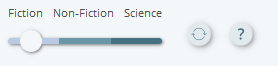
If you make any changes to the document while the chart is open, you can use the refresh icon [ ] to update the analysis.
For further analysis of individual chapters click on “Results”.
This section provides a condensed summary for the three chapters which deviate the most from the average.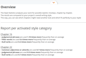
The chart is dynamically linked to your text. This means, if you want to jump in your text to a particular chapter you can. Simply double-click on the chapter in the chart and your document will move to that section, making editing that bit easier.
Readability
The Document Statistics Chart opens in the Style Analysis view by default. To switch the analysis to Readability, click on the [ ] icon in the top right of the dialogue.
As with the Style Analysis chart, the colors are consistent with those in the Readability Settings (Options → Preferences).
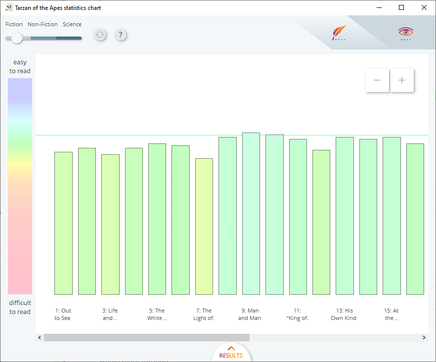
The Readability scale is displayed to the left of the chart.
![]() In the top left corner you can set the style of text: Fiction, Non-Fiction or Science (technical).
In the top left corner you can set the style of text: Fiction, Non-Fiction or Science (technical).
Again, clicking on “Results” will display further analysis for the three chapters which have the highest and lowest readability scores based on the average for your text.
 samuli on April 5, 2022