The active readability evaluation
Readability is how understandable a text passage is based on the writing style.
Academics have carried out intensive research in the area of readability–it can actually be measured very precisely.
You can turn the Readability Analysis on and off by clicking on the eye icon located in the status bar of your Papyrus Author window.
The eye icon
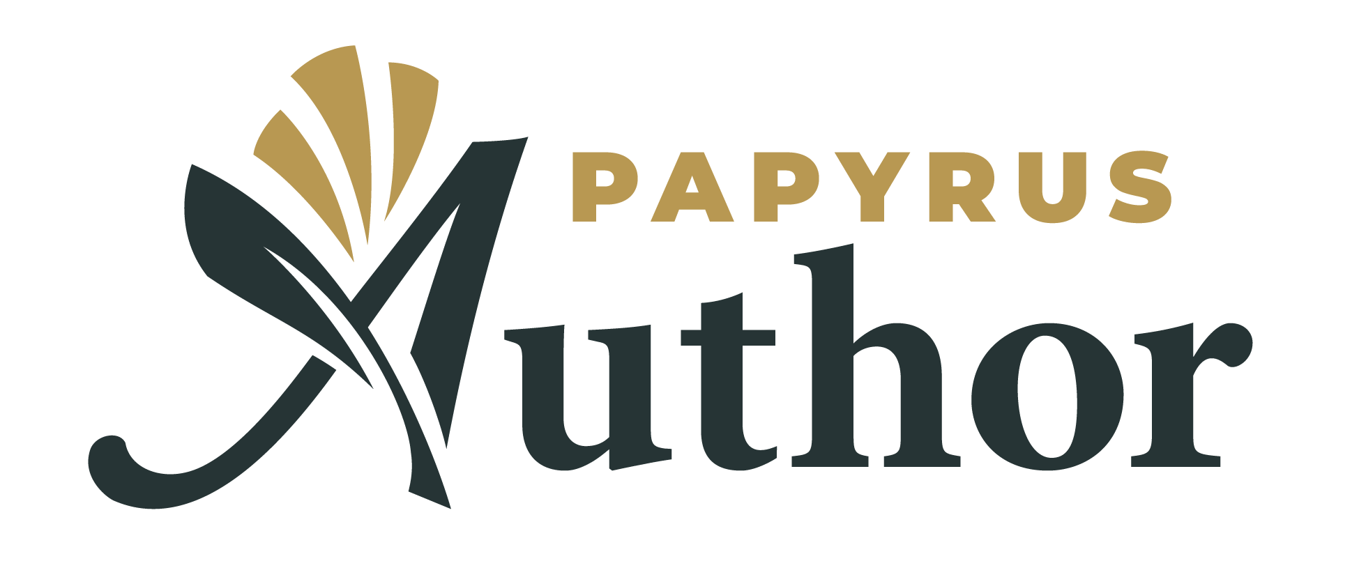
Your text will then be highlighted in different colors. As you go down the rainbow, your text will become more readable. Bright red could be a legal text, and baby blue indicates a text with a readability level similar to a children’s book.
The most important criteria are the “word difficulty” and “sentence complexity.” These can be statistically determined by counting specific elements in your text.
For readability, the number of letters and syllables in each word is counted as
well as the letters, syllables, and words in each sentence. These criteria come together in a formula that has been evolving for decades.
If a program labels your entire text as “unreadable,” it is difficult to go back and improve it. But, if the program identifies specific paragraphs as less readable, then it is easier to see exactly where you may need to revise.
So what exactly does the Readability Analysis tell you? We want to be clear here, the rating is not an absolute test for quality.
Like the Style Analysis, the Readability Analysis is there to help you find obstacles in your text. These are places that could be difficult to read and could pull the reader out of the story. When this happens, the joy of getting lost in a book is gone.
For exactly this situation the Readability Analysis can be very helpful. Dive deep into your text and comb through it passage by passage to increase the readability as a whole.
Each paragraph will be given a color according to its ease of reading.
The Readability Analysis follows the colors of the rainbow:
Dark red – very complex technical texts, legal texts
Light red – complicated explanations with technical terms
Orange – difficult text passages, up to a complex newspaper article
Yellow – average readable text for adults
Green – easily read, normal newspaper text
Light Blue – easy text, can also be read by young adults without difficulty
Dark Blue – “childlike” texts, advertisements
It’s especially interesting to note where “outliers” occur. If these paragraphs are actually used to mark a particular spot in your text, then the change in the readability is not a break, but rather a means of expressing style. If such changes are not intended, though, they often disrupt the flow of your text.
Here it is also important to consider the differences between genres. A children’s book seeks different readability standards than a philosophy textbook.
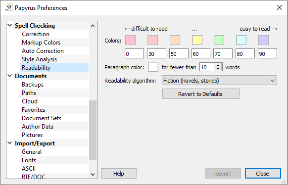
Readability Settings
The Readability Analysis Dialog can be found under “Preferences” → “Spell Checking” → “Readability” or in the context menu ![]() of the eye icon.
of the eye icon.
Readability Settings
In this dialog you can set the colors that the readability rating applies to each paragraph.
You can also assign a “center” value for each color, from which the color will continue to the next.
There is an option to set a minimum amount of words for a paragraph to be analyzed.
Non-fiction books and academic or technical texts are, of course, more difficult to read than a novel. For these types of books, the readability rating can be almost completely red or orange when the normal settings are applied.
This is why there are two categories for texts that are more difficult to read than your standard novel. These settings adapt to the more complicated nature of these types of texts and allow you to differentiate those paragraphs that are more difficult to read than the rest.
For novels and short stories we recommend using the “fiction” setting. The non-fiction book setting allows for a little more difficulty, and at the top are technical texts.
Don’t make the mistake of choosing the setting with which your text looks especially readable (blue and green)–you are in danger of fooling yourself.
A novel, in the “fiction” setting, should have almost no red areas and very few orange or yellow.
Of course, it is also not a bad sign if a non-fiction book or technical text tends toward the green-blue end of the scale.
 on March 30, 2020